You can’t please everyone. But the controversy-mired convention centre expansion proposed for the foot of Burrard Street must satisfy a great many people — not least of all, the city’s residents
Frances Bula
Sun

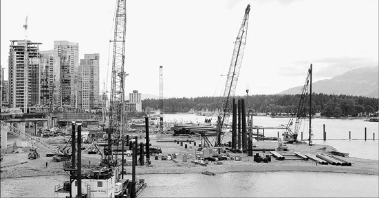
VANCOUVER SUN – The convention centre expansion under construction: Vancouver is about to see the last of its old working harbour disappear. In its place will be the final piece of the new city.

The newest artist’s drawing of the expansion project, incorporating recent design changes
One hundred and fifty years ago, the stretch of shore on Burrard Inlet east of Stanley Park was a tranquil place that the Squamish, Tsleil’wauthuth and Musqueam visited only occasionally. A solitary person standing among the marshy reeds would have heard no more than this: A gull squealing far overhead, a fish splashing, waves lapping quietly.
Today, the sonic booms of piledrivers make the ground shudder throughout the city’s central business district. Graders and trucks growl and grunt atop the gravel, re-shaping the harbour. And the gulls are drowned out by the yodelling of construction workers.
Vancouver is about to see the last of its old working harbour disappear, this place at the foot of Burrard and Thurlow that has been home over the past 125 years to a fish-oil plant (until the herring disappeared from the inlet in 1884), a coalyard, a cow farm run by a trio of greenhorns, rail lines, a customs house, a steamship wharf and a marina for harbour-cruise ships.
Rising in its place will be the final piece of the new Vancouver.
In the next three years, the 4.5 hectares at the foot of Burrard and Thurlow streets — the last empty piece of waterfront between Stanley Park and Canada Place — will be transformed in a way that’s difficult for most people to envision.
The transformation will create a 1.2-hectare urban public plaza, the kind of massive public gathering space this city has never had before. It will put a gargantuan building on the waterfront with an 11-storey glass wall at its highest corner, a building that will more than triple the space of the current convention centre. It will create a 2.4-hectare “living roof” that draws inspiration from a remote island on the B.C. coast. It’s aiming to create a Granville Island-style atmosphere with restaurants, shops, museums and water-oriented businesses. And it will complete the re-branding of Vancouver‘s waterfront, dispelling the last of remnants of its 19th-century colonial resource-town past soaked in creosote and diesel fumes and the stink of herring, to a 21st-century urban entertainment and leisure zone.
None of this is happening easily, though.
No major city construction project is ever a walk in the park, as anyone knows who has ever followed the tortuous trail that leads from Vancouver city hall’s Committee Room 1 to the bank to the concrete mixer to the opening ceremony — as B.C. Supreme Court’s numerous multi-defendant, post-construction lawsuits will attest.
But this project has generated an unusual level of debate and tension between the city’s powerful planning department, which has a couple of decades of experience of successfully arm-wrestling major developers to get the buildings, public spaces, and parks they think the city deserves, and the equally powerful Vancouver Convention Centre Expansion Project team.
Project manager Russ Anthony says the building, which wraps the inner core of convention activities in an outer box of clear glass, is a landmark, one that Vancouverites will come to love for its accessibility and unique B.C. features. And even critics are enthusiastic about some parts of the project, especially the landscape design and the idea of the living roof.
But the reactions to the building and certain other parts of the project from almost everyone who cares about architecture and urban design in the city ranges from resigned acceptance to bewilderment to outrage.
Former Vancouver city planning director Ray Spaxman — the man who led the way 30 years ago to transforming Vancouver’s downtown into today’s dynamic, livable urban core that is regarded with envy by urban planners around the world — calls it “this monster on our waterfront.”
Vancouver‘s head of central-area planning, Larry Beasley, city councillor Jim Green, and pre-eminent city architect James Cheng, who designed the nearby Shaw Tower and the yet-to-be-built 600-foot Shangri-La on Georgia, say the building is not the landmark that everyone had hoped for.
“It doesn’t have to defer to Canada Place,” says Cheng. “It could be its equal. And this building is just one large overall form that isn’t broken down enough so that people can relate to it.”
And the city’s urban-design panel has given it the most lukewarm of approvals.
Besides the building itself, critics are concerned that the project developers have farmed out a key component — the development of the Granville Island-style cluster of commercial and public activities along the waterfront edge and on the water — to private bidders. With the bidding about to close, there are questions being raised about who will actually come forward able or willing to carry out such an ambitious, expensive project.
They’re worried about the project managers’ apparent lack of interest in ensuring that the whole project gives Vancouverites, not just conventioneers, the kinds of public access and activities that have come to be seen as a birthright in this city. And everyone is concerned about how the fixation on staying on budget is affecting the project.
Anthony, an affable but no-nonsense guy who has driven through projects like GM Place and the B.C. Cancer Research Centre on time and on or under budget, says some complaints are inevitable because he has to try to please a whole spectrum of groups: the city, Tourism Vancouver, the provincial government, residents, environmental and fisheries regulators, convention planners. That’s without even mentioning minor considerations like the engineering complexity of building a centre set on a massive underwater concrete platform that sits on 1,000 piles driven into the seabed, or the fact that the city is in the middle of a crisis of escalating construction costs for every project.
“A project like this could be endless,” says Anthony. “We will never satisfy everybody on everything.”
And, he adds, he can’t act like the private developers the city usually deals with.
“There are things that people have wanted where we’ve said, ‘That’s just too expensive or it’s unnecessary.’ We’re funded by a number of governments and we’ve got a fixed budget. We don’t have the luxury of saying, ‘Well, I’ll just charge more for my apartment building rents and therefore I can do whatever anybody wants me to do.’ We have to go back and say, ‘Is this justifiable, is this a prudent use of public funds?'”
Vancouver‘s history with convention centres has always had a flavour of economic and architectural melodrama.
It took years of tussling to get the first convention centre built, a roller-coaster ride of announcements, mounting construction costs, and cancellations, with a final lifering tossed to the project by the federal government in order to get Canada Place, with its sails that have now become a city-defining image, built in time for Expo 86.
The idea of adding more convention space, which kicked off in 1994 when casino entrepreneur Steve Wynn talked about building a combination casino, hotel and convention centre on the waterfront, has gone through a similar
roller-coaster evolution. Three companies with three different sites duked it out for a couple of years. Swashbuckling then-premier Glen Clark picked one site on Vancouver port land and construction started. Then he fell from grace and the project, with construction costs estimated at $1 billion, was cancelled. Business and tourism groups scrambled to put together a replacement project.
Finally, in an echo of the pre-Expo days, Prime Minister Jean Chretien threw the project a lifeline on Dec. 4, 2002, with $200 million in federal funding.
In October 2003 the project team, with renowned Seattle convention-centre specialists LMN Architects and two local firms on board, came up with its first concept for the convention-centre expansion. It got a fairly favourable response.
The convention-centre exhibition hall, usually the least attractive and most inwardly focused box in any convention centre, was underground and backed up against the escarpment that defines the north edge of Vancouver’s downtown peninsula, with other meeting and commercial spaces set in a couple of terraces stepping down to water level.
Compared to the Marathon proposal (pictured here) of 1997 or the design that business and tourism groups had developed in 2001 the project was pulled back out of the water and so it wasn’t as spacious or terraced. But it was considered to be a promising start.
The centre’s green roof was one of the most striking elements. In this first design, the roof, shaped like two large beetle wings, capped a relatively low building and it was going to be open in part to the public, with stairs leading up from the plaza level to the west. There was even some giddy talk at the time of having mountain-bike trails, among other public activities, on the sloping roof.
But throughout the next seven months, the design changed. It went through what’s called “value engineering” — a fancy phrase for trimming the budget.
OTHER CITIES, OTHER PROJECTS
Pittsburgh
BUILT: 2003
ARCHITECT: Rafael Vinoly
WHY IT’S SIGNIFICANT: It’s billed as the world’s first “green convention centre,” with a high proportion of natural lighting and ventilation. Its peaked roof gives the centre a distinctive, dynamic image. It has also received praise for the way it complements its river settings. Convention planners are critical, however, because they say that it doesn’t function well for actual convention activities.
San Diego
BUILT: 1989
ARCHITECT: Arthur Erickson and LMN
WHY IT’S SIGNIFICANT: It’s praised for its striking design from the outside that, with its sail-like roof, gives the project a marine feel and became one of the most recognizable city images, an instant icon for San Diego, just as Canada Place did for Vancouver. However, it has been criticized for the way it cuts off San Diego from its waterfront, a problem Vancouver has been fighting to avoid.
Hong Kong
BUILT: 1988
ARCHITECT: Skidmore, Owings & Merrill
WHY IT’S SIGNIFICANT: Hong Kong‘s convention centre has a landmark feel to it because of its exuberant roof. It combines a sense of place with a functional convention centre, unlike some centres that are designed to prevent conventioneers from much contact with the city they’re in. The building was forced to go up rather than out because of the high cost of land in Hong Kong.
Honolulu
BUILT: 1996
ARCHITECT: LMN Architects
WHY IT’S SIGNIFICANT: The design focused on a building that reflected Hawaii‘s history and culture and Waikiki‘s environment. Built with a street on one side and a canal on the other, it has a striking main entrance. It incorporates native Hawaiian materials, plants, and references to the islands’ past — part of the new trend of building convention centres that reflect their settings rather than shutting them out.
© The Vancouver Sun 2005
