Michael Sasges
Sun

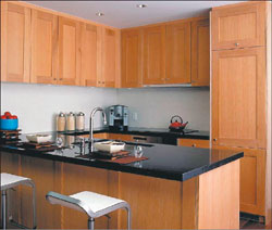
When he first visited the presentation centre, Raffles prospect Howard Don reports, he had to really look to find the fridge. It’s behind the ‘pantry’ door in the photograph (left), a compact affair from a Swiss manufacturer, Liebherr. Miele will supply the cooktop, wall oven and dishwasher and Panasonic, the microwave. In the bathrooms (left and right) the developer selected Caroma for the toilet and basin and La Torre for the bath and show fittings. Marble will top counters in most of the Raffles bathrooms; polished granite, the kitchen counters.

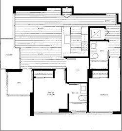
The floorplans for 32 of the Raffles tower-homes are reproduced here. The smallest Raffles apartment (above) offers about 565 square feet of one-bedroom-with-den residency; the largest (right), about 865 square feet of two-bedroom residency, with den and flex room. Their runtof-the-litter status has not denied the smallest homes topdog prominence. They are repeated on 16 south-facing floors, the biggest homes right next door.
RAFFLES
Project location: Robson and Cambie, downtown Vancouver
Presentation centre: Hamilton at Smithe
Telephone: 604-689-8058
Web: RafflesonRobson.com
Project size: 150 townhouses and apartments, 22-storey building
Residence size: One bedroom; one bedroom + den; two bedrooms; two bedrooms + den, 565 sq. ft. – 945 sq. ft.
Prices: One bedroom, from $319,000; one bedroom + den, from $335,000; two bedroom + den, $464,000
Developer: Aurmon
Architect: Hancock Bruckner Eng + Wright
Warranty: Willis 2/10/10
Occupancy: Fall, 2007
On one of the walls of the Raffles presentation centre hangs a rusted steel charger from Martha Sturdy, figurative profession of the possibility that to live in this downtown tower is to arrive — in a living space infused with Zen-like tranquillity.
It might, however, speak as much about public journey as it does about private arrival, a downtown journey east by tower-home seller and buyer generally and, specifically, by one of their most important mediators, Bob Rennie. (The Sturdy plate is big enough, is worthy enough, to accommodate everybody’s purposes, its diameter 36 inches, its depth four inches and its retail price $790 “with hook.”)
Sixteen months ago veteran condominium marketer Rennie issued a dare, and city hall’s
Larry Beasley an ultimatum, to downtown-tower developers, Go East.
After 10 years of adding 1,500 to 2,500 homes annually to the downtown peninsula, they advised in separate addresses to the development fraternity, you are running out of land in the peninsula’s western and central parts and, further, city hall was planning new restrictions on the use of the remaining sites in those parts.
If developers wanted another 10 years like the previous 10, they must go east, to Chinatown and Gastown, the Downtown Eastside, the False Creek flats and southeast False Creek.
At the Raffles new-home project at the intersection of Robson and Cambie streets, Bob Rennie has, indeed, gone east.
His walk your talk starts at the two-Starbuck intersection of Robson and Thurlow. A block north is the Living Shangri-La new-home project. It and Raffles are Rennie Marketing Systems jobs. In between Living Shangri-La and Raffles are two more RMS jobs, L’Hermitage and R&R, both at the intersection of Robson and Richards.
“Robson is becoming a much longer street,” Rennie says, a “more animated walk.” Raffles and Living Shangri-La are nine blocks apart, eight short blocks and one long block, the Vancouver Art Gallery block. By the electronic map on city hall’s web site the two new-home projects are a little more than half-a-mile apart.
One institutional move – of the main library to Robson and Homer from Robson and Burrard – and some retail moves created Robson Street‘s eastern expansion, Rennie says. (Raffles, in the sales literature, is located in the “library precinct.”)
The arrival of a Chapters bookstore, with a Starbuck’s, at Robson and Howe was the inaugural retail pull; the arrival of a Winnners apparel and home-accessory store at Robson and Granville, the second.
“My theory is, as soon as we got Chapters on Robson at Howe that pulled Robson over Burrard Street. It wasn’t really vibrant beyond Burrard. . . . . Then we got the Winners at Granville and that pulled Robson all the way down.”
At Raffles the inevitable retail component will face Robson; live-work lofts will face Cambie. “Cambie’s not a prime retail street. Robson is the retail street.”
Anybody who knows the upper floors of the main library knows the prospects to the south and east are equal to the prospects to the north and west, if different, more, or all, built environment, less, or some, natural.
Those prospects very much influenced the design of the Raffles building and presentation centre. The building design protects the views of neighbours. The presentation centre projects the view possibilities.
The building has three components visible from the street, two of them steps back, or south from Robson, to the tower component. “The building setbacks protect the views of the neighbours to the west, to make sure they had view protection,” Rennie says.
The presentation centre’s most important vignette is a picture-window view across False Creek, a representation of the views from upper-storey homes on the south and east sides of Raffles.
No you probably can’t place a big sectional and a dining table with sidechairs in a Raffles apartment, Rennie says. ”Yes, if you’re going to rely on the big bar service, the four bar stools, if you will eat there and enjoy yourself there, you can have as big a sectional as your want.
“Put in a dining room and you can only put so big a sectional in. You can’t have it all under $350,000.”
What will be there will be artfully designed to appear bigger than it is. “[The] spacious design of every home maximizes usuable living space,” the sales literature promises.
The most visible manifestation of this pledge in the presentation centre is the refrigerator, manufactured by a Swiss company. It was selected because, at 27 inches in depth, it’s no deeper than the kitchen counters and it will be faced with a cabinetry finish. Like most anything that meets special needs, it also comes with special price, $4,700, almost as much as a big Sub-Zero, Bob Rennie reports.
“In these open-floor plans, appliances have to become furniture,” he comments.
A prospective Raffles buyer, Howard Don, recalls that when he first visited the presentation centre he decided that it must not be finished because at first he couldn’t see a refrigerator anywhere.
”Because I was talking on a cell phone no sales reps approached me. Then I started snopping around and opening up drawers and cabinets and, behind a large pantry-like door, the fridge was there, kind of small, but pretty cool.”
He is not much of a cook, he reports: “My financee is a very good cook. My form of cooking is pulling out the credit card for take-out.” The two will marry next September.
Howard is a 33-year-old Vancouver native, educated at the B.C. Institute of Technology and the Southern Alberta Institute of Technology. He is also a basement-suite graduate.
A Yaletown apartment-owner already, he reports growing up in a ”Vancouver Special” helped him prepare for small-space living as an adult.
”The basement suite where I hung out the most and where my bedroom, and my brother’s bedroom, were is quite similar to a condo.
”Two small bedrooms, a full washroom, washer-dryer . . . well, by the boiler and furnace . . . kitchen attached to the living room, sounds like I was living in a condo through all my years, doesn’t it?”
”I did purchase ‘condo-sized’ furniture for my current residence, expanding dining-room table, laptop, easily movable single chairs. So I’m not worried about how much furniture I can get in there . . . I am a bit of a minimalist . . . but I am really concerned with finding things that I really like that will fit in there.”
Two things he knows from apartment residency in Yaletown: A black colour scheme “makes life eaiser” and views there are hard to come by.
If he buys at Raffles, and he expects to, he will select the “Black Mahogany” scheme and not the “White Oak” scheme.
If he lives at Raffles, he won’t do so because of the lure of the views. “You’re not really going to get a view living in Yaletown. If you are looking south and west, the Concord buildings are there. North you will be staring at other things. East there is nothing to look at. I hope I can see past the building on the next block.”
Instead, his residency in Raffles, if it comes about, will be motivated by a certainty that this new-home project is an “opportunity.”
“I do not know if I am going to live in it or I will rent it out or one of my siblings is going to live there.
“The price was right, however, for a one bedroom. The fixtures and finish are gorgeous . . . And Rennie Marketing [Systems] is on the job. So I know the building and builder are sound. I hope this is a smart purchase and all the attributes of the building are signs leading that way.”
He thinks one of the building’s amenities – the bicycle-storage facility – an important component of the project, but is less sure about another – the concierge.
“A bicycle storage is very imporant to me. At present I do not own a bicycle, but would like to know there is a place to keep one, with the limited living space and barbecue space on the deck.
More importantly bicycle storage eliminates riding up in an elevator with bicycle and freshly sweaty rider . . . .”
That a young Vancouver man might not have any ”expectations” of personal service from a concierge, but every expectation a concierge will make the building a safer place does not surprise Bob Rennie.
“The first role of the concierge is all about security, that visible presence,” Rennie says. ”The second role is opening the door for someone loaded down with packages. We pretend they might get you airline tickets. They really won’t. They’re an on-site service. And I don’t think [the Raffles] buyer is buying for that. They’re buying security.”
Raffles, by the way, does not end Bob Rennie’s eastern foray. He’s preparing now to market East in Chinatown and Woodwards, both east and north of Robson and Cambie. And he has bought the oldest building in Chinatown, next door to the East new-home project, and plans to convert it into Rennie Marketing Systems’ corporate offices and a private art gallery.
Either in between or at the same time, however, he will do some backtracking to Hastings and Howe for Jameson House, which is he now advertising, and to Coal Harbour.
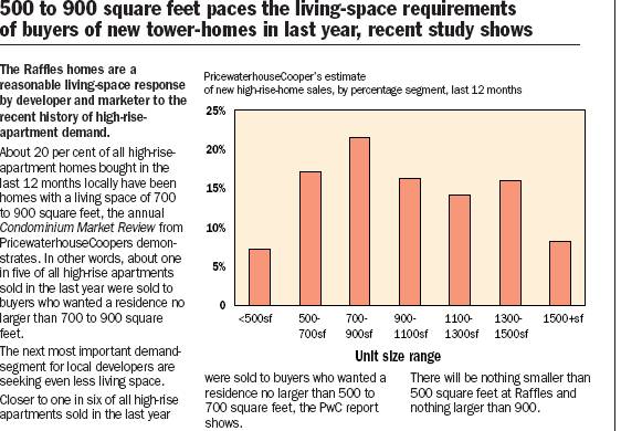
500 to 900 square feet paces the living-space requirements of buyers of new tower-homes in last year, recent study shows
The Raffles homes are a reasonable living-space response by developer and marketer to the recent history of high-rise-apartment demand.
About 20 per cent of all high-rise-apartment homes bought in the last 12 months locally have been homes with a living space of 700 to 900 square feet, the annual Condominium Market Review from PricewaterhouseCoopers demonstrates. In other words, about one in five of all high-rise apartments sold in the last year were sold to buyers who wanted a residence no larger than 700 to 900 square feet.
The next most important demand-segment for local developers are seeking even less living space.
Closer to one in six of all high-rise apartments sold in the last year were sold to buyers who wanted a residence no larger than 500 to 700 square feet, the PwC report shows.
There will be nothing smaller than 500 square feet at Raffles and nothing larger than 900.
Life in a glass house requires respect for the view and its patterns
Nancy Bendtsen
September 24, 2005
Raffles is the latest Bob Rennie/Inform Interiors collaboration. The Gastown retailer’s Nancy Bendtsen advanced a memorable addition to the ledger that enumerates the Vancouver ambience while describing how to live with the views on offer at Raffles. She writes:
A huge view calls for a quiet living situation. Our home is our refuge, our quiet calm space.
There are three main issues: [1] The busyness and colourfulness of the patterns of the view; [2] the colours that go with so much light; [3] the sensitivity of art in that kind of situation.
One cannot have too much form, height, colour or pattern mixed in with the furniture. It would conflict with the view. And this comes from my personal perspective as we have a glass house, with a view, and we have eliminated most of the colours and patterns over the last 10 years. They just didn’t work. I would suggest a light, low, blocky sofa with matte non-reflective horizontal table surfaces.
About the other view issue, the light, I recommend greys, whites, colours that allow the colour of the light to vary them. And a mute, not boring beige, a mute clear palette. The light in Vancouver is grey with yellow and green in it, so the colours should harmonize and reflect those colours.
Art is an issue because so much paper-based art is light sensitive. One either has to have paintings that can withstand the onslaught or really good blinds to protect the investment. As opposed to the furniture, I feel that the art must be bold and hold its own with the view.
© The Vancouver Sun 2005

