Expect more notice of our passions, less of our possessions
Sheryn Calvert
Sun

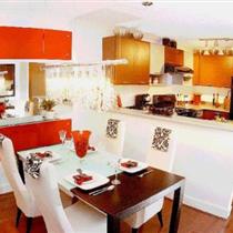
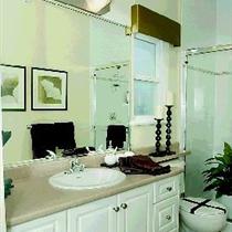
One of her 2005 commissions was the show home (above) for the Sawyer’s Landing single-family-detached new home project in Pitt Meadows.

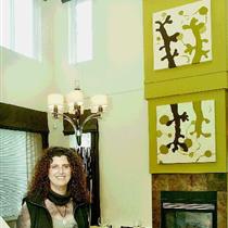
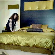
Sawyer’s Landing show home in Pitt Meadows features the interior design work of Sheryn Calvert. Photograph by : Ian Lindsay, Vancouver Sun

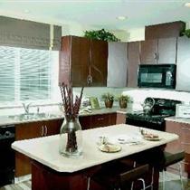
Kitchen in Sawyer’s Landing show home in Pitt Meadows features the interior design work of Sheryn Calvert. Photograph by : Ian Lindsay, Vancouver Sun

Master bathroom is an eyecatching feature in Sawyer’s Landing showhome in Pitt Meadows. Photograph by : Ian Lindsay, Vancouver Sun
The Granville Greene show home prepared for Adera Development Corp. by Sheryn Calvert is a finalist in the best multi-family display-suite category of an annual competition sponsored by the B.C. branch of the Canadian Home Builders’ Association and called the Georgies.
Calvert, owner of Calvert Design Studio, has practised her craft for almost two decades and is no stranger to construction and development industry honours, including finalist and winner status in three previous Georgie competitions.
What were the ”hot” design trends in 2005? Which among them are more likely to endure? How successful have we new-home designers been in identifying and advancing solutions to buyers’ needs?
Let me start my answers by comparing design trends.
Good design is personal because it must meet the needs and facilitate the lifestyle of all the members of a household.
Good design allows them to work and play better; it offers them ways to negotiate their lives inside and outside the home.
Design trends have another purpose: Their coming and going is very good at facilitating consumption . . . of new homes, of course . . . and of kitchen counters topped with granite, not laminate . . . of ceilings nine feet, not eight, above our floor nine feet, not eight, above floors of hardwood, of course . . . of appliances enclosed in stainless steel, not something unidentifiable . . . of big decorative faucets and bigger tiles, with an intimation of European provenance.
Trends are cyclical. My mother, my biggest helper, took one look at the Sawyer’s Landing display suite and its apple-green and espresso-brown colour scheme and said, ‘this looks like our house 20 years ago!’ Indeed, these are colours we now are seeing everywhere, in fabric and paint and accessories and fashion — and did not see for many years.
Parenthetically, we are very driven by European styles in metro Vancouver, so much so that we may be the most progressive and ”take a risk” Canadians in the country.
We are not afraid of colour here! Additionally we are not afraid to express our colour preferences by choosing the unfashionable, or ”unchoosing’ the fashionable.
In display suites, our specialty at Calvert Design Studio, our job is to experiment with bold colour and to introduce an almost-over-the-top creative element into the display.
Our purpose, of course, is to make one show home more memorable for a prospective buyer than all the other show homes he or she may have seen in a weekend.
We want to appeal to the senses. We frequently commission original pieces of art for show-home display to reflect the passion of the moment.
At Sawyer’s Landing, we designed a boy’s bedroom in a nature theme with grass painted on the walls at baseboard height and larger-than-life insects poking out all over. ”Fantasy” matters in the display suite.
But, then, so does reality. And one of the realities today is that increasingly people are committing to more responsible consumption, to ”greener” and ”cleaner.”
Consequently, more developers and builders are providing ”green” homes as mainstream, not niche, products.
The introduction of recycled and recyclable materials — glass tiles, cork or bamboo flooring, natural stone and wool-blended carpets — is just one of the more obvious interior-design signals of this response.
Another reality is that more people are living in smaller spaces.
These homes, if they are to work for their occupants — my definition of good design, remember — must maximize space.
Built-in millwork in every finish is one movement towards to the simpler, smaller choices so many of us are making and accordingly is a candidate to become an enduring trend.
We want granite in our kitchens, but we also need ”recycling depots,” easy to access when our hands are full of recyclables, and to clean, when our days are full of competing duties.
We want electronic connections to the world outside the home, but we need computer stations that are integrated into our living areas, full of storage compartments in which to hide the clutter, neither a focal point nor an eye sore.
We are designing built-in millwork for every function imaginable . . . homework desks in kid’s rooms . . . headboards and night tables in master bedrooms . . . entertainment centres in family rooms and great rooms . . . shelves around fireplaces.
This trend enables us to streamline, and de-clutter, our lifestyles.
It declares, in this home might reside people whose focus is on opportunities to live life to its fullest, not on acquisitions and possessions.
In the past, too much of our interiors demanded our attention: Wallcoverings were busy and full of pattern; draperies had trims and tassels; accessories sunk many a room. Consumption, consumption, consumption!
In contrast, today’s interiors designed and organized with a purposefully minimal hand, everything streamlined and simplified, permit residency in, or occupancy of serene and peaceful environments. I think this is the goal more frequently than not today, for designer and client.
In closing, I think most people are very aware of our precious world and its diminishing resources and are responding with choices and decisions to live smaller and simpler. We want our homes, accordingly, to reflect these commitments.
In other words, I think the design trends that are more likely to endure, in the new year and into a new decade, are those that allow us to live with our passions as much as we live with our possessions.
© The Vancouver Sun 2005


