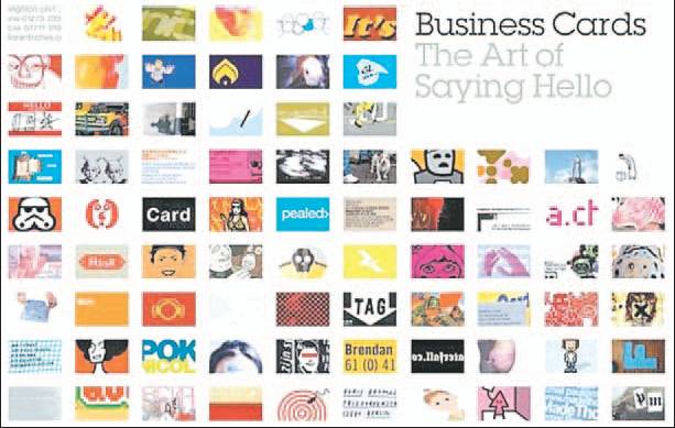
FIRST IMPRESSIONS: Design vital in getting right message across
STEPHANIE WHITTAKER
Province

They might be small, but business cards can say a lot about you and your business.
MONTREAL — What does your business card say about you?
Does it tell the world that you’re a swashbuckling entrepreneur with a cutting-edge company?
Does it say you’re a solid, reliable professional known for your integrity?
Or does it convey how creative and hip you are?
They might be small, but business cards can communicate all of the above through their design.
“A business card tells a story,” said Eva Kutyla, a graphic designer and the art director of E.A.C.H. New Design in St. Laurent, Que.
“The business card is the branding of a company and your first visual impression of it. It creates a character for you and your company.”
And like every other communications tool, business cards change according to trends in design.
“Right now, we’re seeing a lot of simple, refined cards,” Kutyla said. “Many are grey and charcoal, colours that have taken over black because it’s a more sophisticated look. This is the Japanese influence on the whole design industry. The look is now Zen, minimalist. When you see that clean, minimalist look on a business card, the impression it conveys is that the company is following design trends. It’s a leader and it’s mainstream.”
One of the challenges of creating a business card these days is the volume of information that should be included. In addition to listing a land-line phone number, contemporary business cards are also likely to include a cellphone number, a fax number, an e-mail address and a website address.
Instances in which a double-sided card is useful, Kutyla said, is for businesses that have several locations. The back side of the card is the best spot to list them.
One piece of advice is to design business cards that are a component of their overall business communication tools.
Another trend is a conservative approach to sharing personal information on the card among women who run home-based businesses.
Kutyla says it’s a challenge not to clutter a card with words. “It needs to be cohesive and understandable,” she said. “The logo should be predominant and not diminished by the words. The logo needs its breathing space because it’s part of the identity of a company.”
One trend she’s observed is information wrapped around the perimeter of a business card, forcing the viewer to rotate it while reading. Kutyla advises her clients not to rotate phone numbers and e-mail addresses, which are key pieces of information.
“And keep in mind that e-mail addresses are top priorities right now, even more important than phone numbers.”
Counsellors advise their clients to list e-mail addresses that they’ll have in the long term.
“For instance, you shouldn’t use your school address and you should never use a cutesy e-mail address,” Kutyla said.

