Don’t expect to see the new convention centre on postcards any time soon
Miro Cernetig
Sun

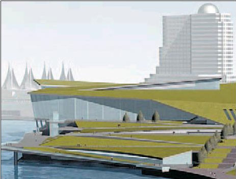
An artist’s drawing depicts the Vancouver Convention & Exhibition Centre expansion with its rooftop garden.

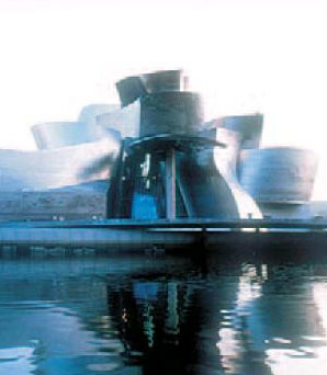
The Guggenheim Museum in Bilbao, Spain, is drawing crowds to the city
It’s often said God was Vancouver‘s architect-in-chief, creating the sea, the snowcapped mountains and backdrop of deep, green rain forest that make this city stunning. But good gosh, isn’t it time the mere mortals on the ground started pulling their weight, too?
I raise this suggestion after spending the last few years watching, with great expectation, the rise of our latest addition to the waterfront: the expanded Vancouver Convention & Exhibition Centre.
There’s been a raging debate over the fact the near $1-billion price tag of this new edifice far exceeds planners’ — and taxpayers’ — expectations. But less talked about is that this “signature building” falls far short of another expectation: great architecture.
To be fair, it’s no outright disaster. It seems well-engineered, something you’d expect given the cost overrun. And as a building designed to attract conventions and offer visitors an impressive view of the water and mountains once they get here, this mostly glass structure, with its six-acre roof garden, will do the trick.
But don’t expect anyone to be sticking this building on postcards or Architectural Digest to be putting it on the cover.
From a design perspective, the convention centre is esthetically underwhelming, more a triumph of engineering than architecture. The word mediocre comes up repeatedly whenever I ask people who watch these sort of things in the city.
“It’s not a terrible building,” says Gordon Price, director of the City Program at Simon Fraser University. “But it’s not a great building, either. We could and should do better.”
Aside from its roof garden, expected to be covered in West Coast flora, and its promise to be the most environmentally sensitive convention centre yet, the structure cuts, well, a conventional profile on the skyline.
In fact, at this stage it seems to fall short of two of the key principles city planners set out in 2003 in a Vancouver Sun article: The building’s profile wasn’t supposed to compete with the sails of the Pan Pacific, one of the city’s true architectural icons, and it wasn’t supposed to look like a big box on the waterfront.
Well, walk around the site and see for yourself what’s going up on the shores of Coal Harbour.
The glass skin that is now being put over the skeleton of concrete and steel girders is clear, thankfully. But this is definitely a massive box we’re getting, albeit one with a few graceful curves engineered in.
It is also very high — in fact it seems monolithic in the context of the buildings around it — and it does detract from the majesty of the Pan Pacific’s white sails. As for that cool roof-top garden we hear so much about, it’s going to be inaccessible from the ground and most of it will be difficult to see unless you happen to be flying over in a float plane or are gazing down from your hotel room’s window.
There’s not much you can do to change a building that’s mostly up and is hopelessly overbudget, of course. But there’s a lesson to be learned here in the future development of the city: Put architects back in control of how our major buildings, both public and private, will look.
We need the engineers, planners and politicians to keep the costs in line and keep things real, but don’t let them water down the great designs, as so often happens behind the scenes.
The reason is that great architecture doesn’t just make a city a nice place to live — it can build your economy.
It can be risky, as Montrealers who spent a generation paying off Olympic Stadium found out, if you don’t do it right. But it can also put you on the map.
Consider Bilbao, Spain. Once a nondescript town that seemed to be sliding into oblivion, its city leaders decided to build a branch of the Guggenheim Museum and gave a cutting-edge architect the job: Canadian-born Frank Gehry.
He came up with the swirling titanium museum that cost about $120 million. It has transformed Bilbao into a world destination and revived the city’s economy. I wonder what he would have done with a billion dollars?
The point here isn’t for Vancouver to copy Bilbao. But it is an encouragement to start thinking their way when it comes to how this city’s skyline will look in the years to come.
In the run-up to the Olympics and beyond, Vancouver has some big development decisions to make that could put us on the cutting edge of architecture.
Large sections of the waterfront are up for development. The city seems to have opened the door for taller buildings, even skyscrapers. And the provincial and city governments are going to be grappling with the construction of a new stadium on the waterfront, the building of a new art gallery and perhaps even the creation of a concert hall, something all great cities need.
So, who do we want to do the dreaming up of how these buildings will look?
A committee or an architect? Let’s hope it’s the latter.
© The Vancouver Sun 2007

